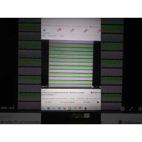
การแปลง 3D และแอนิเมชั่น ภาพหมุน Logo หมุนรอบตัวเอง
7
ต.ค.
ต.ค.
2021-10-07 10:43:03
496
siamweb2u
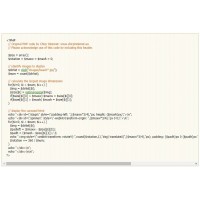
@-webkit-keyframes spinner {
  from {
    -webkit-transform: rotateY(0deg);
  }
  to {
    -webkit-transform: rotateY(-360deg);
  }
}

#stage {
  margin: 1em auto;
  -webkit-perspective: 1200px;
}

#spinner {
  -webkit-animation-name: spinner;
  -webkit-animation-timing-function: linear;
  -webkit-animation-iteration-count: infinite;
  -webkit-animation-duration: 6s;
  -webkit-transform-style: preserve-3d;
}
#spinner:hover {
  -webkit-animation-play-state: paused;
}

#spinner img {
  position: absolute;
  border: 1px solid #ccc;
  background: rgba(255,255,255,0.8);
  box-shadow: inset 0 0 20px rgba(0,0,0,0.2);
}


<div id="stage" style="background: rgba(0,0,0,0.5);"> <p id="spinner" style="background: rgba(0,0,0,0.5); text-align: center; color: #fff;">Stop, I'm getting dizzy!</p> </div>

https://www.the-art-of-web.com/css/3d-transforms/